Brain activity visualization formats for public art
Okay, so picture this: you've spent three weeks prepping your EEG pipeline, you've got a clean signal from your Muse headband, and you finally drag a friend into your lab to show them your “brain…
Okay, so picture this: you've spent three weeks prepping your EEG pipeline, you've got a clean signal from your Muse headband, and you finally drag a friend into your lab to show them your “brain art.” They look at the screen for maybe four seconds, say “neat,” and ask if you have any coffee. That's the public engagement problem in a nutshell: beautiful neural data, zero accessibility.
Compare car rental deals in United Kingdom
See available offersPartner link — DiscoverCars comparisonIf you're building anything from a museum kiosk to a full-on festival installation, the visualization choice will either pull people in or lose them before they finish reading the first panel. A technically elegant display can still fail as public art if the audience cannot tell what is changing, what they are supposed to do, or whether their actions have any relationship to the result.
The good news is that a whole generation of sci-art practitioners have already fought this battle. The formats that work in public settings tend to cluster into a handful of repeatable architectures: immersive environments, affective maps, sonification, generative systems, and physical transduction. None is a magic solution. Each makes a different bargain between scientific legibility, visual pleasure, participant agency, hardware complexity, and the amount of explanation a stranger is willing to absorb.
Immersive Environments: Scaling Neural Data to Geodesic Domes
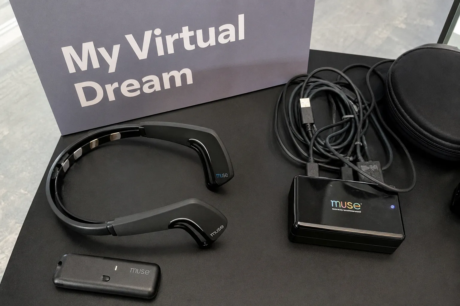
The first time you stand inside a properly built dome installation, you understand why this format keeps appearing in proposals for public neuroscience. The MyVirtualDream project, which debuted in 2013 at Toronto's Nuit Blanche, ran an 18-meter geodesic dome where up to 20 participants at a time wore wireless Muse EEG headbands feeding into “The Virtual Brain” simulation. Over a single night, the project collected usable neural data from 523 participants.
The number is impressive, but the more interesting achievement is architectural. A dome turns a private measurement into a shared environment. Instead of watching a line chart that only makes sense after a seminar, participants sit beneath a changing field of geometry, color, and motion. Their data becomes part of a collective audiovisual space. Even visitors who are not wearing a headset can understand that something is being generated, modulated, or redistributed in response to the people inside.
That is why the dome format often solves the “four-second problem” before it starts. You are not asking a participant to read a screen. You are asking them to sit, breathe, and watch the geometry of their own attention ripple across a ceiling-spanning projection. The feedback loop remains an interpretation rather than a literal window into thought, but it can still make an abstract physiological process feel present.
Neurofeedback in this environment may also influence how quickly participants recognize that their state is part of the interaction. The exact effect depends on the task, the signal-processing pipeline, the instructions, and the individual. A short settling period can be enough for someone to notice that changing their breathing, gaze, or effort appears to alter the visual field; for another visitor, the relationship will remain ambiguous. That ambiguity is not necessarily a failure. It becomes a problem when the installation presents an unstable or delayed response as if it were a precise measurement.
Practically, you need three systems working in harmony:
- A wireless EEG acquisition stack, often based on consumer headbands because they are easier to fit and less intimidating than gel-based caps.
- A projection rig calibrated for low-ambient-light surfaces, with enough brightness and contrast to survive the venue rather than only the black-box conditions of the lab.
- A middleware layer that receives the EEG stream and maps selected features to visual parameters in TouchDesigner, Resolume, a custom shader pipeline, or another generative engine.
Most dome teams end up writing their own OSC bridge between the EEG stream and the rendering system. The bridge is not the glamorous part of the project, but it determines whether the installation behaves like an instrument or like a collection of disconnected effects.
Calibration deserves more attention than it usually gets. There is no universal rule that says the alpha band must control color temperature, or that one particular band should always determine the dominant visual variable. Alpha activity may be a useful input for a given piece, but the mapping is an artistic and methodological decision. It should be tested against the behavior of the signal, the expectations of the audience, and the visual language of the work.
A robust calibration process asks several practical questions:
1. Does the mapped parameter change often enough to remain perceptible without becoming nervous or noisy?
2. Can participants influence it in a way they can learn, or is the system mostly reacting to artifacts and incidental variation?
3. Does the visual result remain coherent when the signal is missing, delayed, or temporarily unreliable?
4. Can a visitor understand the relationship without being told that the color “is” their alpha activity?
The last question matters. Public art does not need to reduce every signal to a label, but it should not disguise an arbitrary mapping as a direct translation of mental content. “The system uses changes in alpha-band power to influence the color range” is a defensible description. “This color shows your level of calm” is a much stronger claim, and usually a less accurate one.
The real constraint here is spatial and economic. Eighteen meters is not a rental cost; it is a venue commitment. You need sightlines, controlled light, safe cable routing, enough clearance for a seated audience, and a way to manage people entering and leaving while the system is active. If you are prototyping, build a half-scale dome in a blacked-out gymnasium first and watch whether visitors stay engaged beyond the novelty of putting on a headset. The relevant measure is not only how many people enter. It is whether they understand what is happening well enough to remain curious.
Affective Mapping: Translating Emotional States into Interactive Media
Now let’s talk about the format museums often find easiest to frame: affective mapping. It fits inside a gallery wall, produces an immediately legible press image, and can give a visitor a visible response without requiring a large architectural build.
Affective mapping takes EEG-derived features or state classifications and routes them to interactive visual or auditory systems. The labels may include engagement, excitement, meditation, or frustration, depending on the headset and its software. The labels are useful as interface language, but they should not be confused with direct readings of private emotion. They are classifications produced by a particular algorithm under particular conditions.
The state.scape installation is a useful example of the form. EEG-based BCIs feed into a Unity3D virtual environment, and the system drives features such as a computer-animated flock of birds. Cohesion, speed, and color shift in response to the participant’s changing input. The participant moves, the flock moves, and the loop feels intuitive without an instruction manual.
That intuitiveness is the central design advantage. You do not need to explain spectral power before the first interaction. A flock that gathers, disperses, accelerates, or changes direction provides an immediate perceptual vocabulary. The audience can understand that the system is responsive even if they have no idea whether the underlying input is alpha power, a proprietary engagement score, or a combination of channels.
The Courtauld Gallery pilot in November 2023 pushed this format toward the act of looking at art. Visitors wore headsets while viewing actual paintings, and their brainwave data drove real-time visualizations on adjacent screens. The interesting part of that setup was not necessarily the precision of the display. It was the framing. Visitors were not asked to “produce” a brain state in isolation. They were invited to notice their response to a painting, while the neighboring screen offered an interpretation of that response.
That distinction changes the role of the visualization. It is no longer a dashboard reporting an internal score. It becomes a second surface for attention: a translation of the encounter between viewer, artwork, and measurement system. The system can still be technically modest and artistically successful if the visitor understands that it is showing a mediated response rather than revealing the hidden truth of the painting or the person looking at it.
If you are building this kind of installation, the practical decision tree is fairly clear. Are you classifying discrete states, or are you mapping continuous spectral features such as band power and coherence-related measures?
The continuous approach is usually easier to document and reproduce. It lets you explain what the system receives and how those inputs affect the media. The classified approach is often more legible to a lay audience in the first ten seconds. “The flock responds to changes in the participant’s estimated engagement” is easier to grasp than a sentence about normalized theta-to-beta ratios.
The trade-off is that proprietary state classifications can be difficult to interpret from the outside. The exact calculation behind “excitement” or “meditation” may not be fully published, and the output can be sensitive to headset placement, calibration, movement, and the assumptions built into the training data. If you use such a score, describe it as an estimate generated by the system, not as a direct measurement of emotion.
Many successful installations combine both layers:
- A high-level state estimate provides the broad behavior that the visitor can recognize.
- Continuous features modulate texture, motion, density, or saturation underneath.
- A stable baseline prevents every small fluctuation from producing a dramatic visual shift.
- The interface explains the relationship in plain language without pretending that the mapping is biologically inevitable.
Latency matters here, but a single universal threshold is not the point. A delay that feels acceptable for slowly evolving color may feel broken when it controls the direction of a flock. The perceived lag depends on the visual variable, the pace of the artwork, and whether the participant has a clear action to perform. Test the complete pipeline rather than measuring only the headset or only the renderer. The delay between signal acquisition, preprocessing, classification, message transport, and display is what the participant experiences.
A public neural visualization does not have to show the brain “as it is.” It has to make its translation visible enough that the audience can stay curious about what has been changed, simplified, and imagined.
Sonic Sculptures: Mapping EEG Parameters to Audio Synthesis
This is the format overlooked by everyone who assumes “brain art” means visuals, and it has one of the cleanest conceptual routes into public engagement. Sonification maps EEG parameters into audio synthesis, allowing the audience to close their eyes and listen. That matters in a gallery where a projected image may compete with paintings, signage, other visitors, and the participant’s own visual fatigue.
The After Images project, published in early 2026 through MIT Press, offers a rigorous recent example. Researchers mapped visually evoked potentials triggered by optical illusions into dynamic visual art and sonic sculptures. Audio parameters included grain size, pitch, panning, low-pass filter cutoff, reverb, and delay, all driven by selected EEG channels or derived features.
That does not mean there is a one-to-one acoustic equivalent for a visual-cortex response. The signal is being measured, processed, scaled, and mapped into a sound system through a chain of design decisions. A change in the measured feature can produce a change in the acoustic output, but the output is not the neural event itself. It is an audible interpretation of a parameter extracted from that event.
That distinction is not a technical footnote. It is the difference between a strong sci-art explanation and an inflated claim. The peer-review value of this approach comes from making the chain inspectable: researchers can state which signal was recorded, which feature was calculated, how it was normalized, and which synthesis parameter it controlled. The mapping can be evaluated without pretending that the sound carries an unaltered message from the brain.
For a working lab or studio, the open-source path is the Brainwave Virtual Instrument, a synthesizer built in the Faust programming language that translates EEG data into parameter controls using OSC messages. If you have ever wrangled MIDI mapping in Ableton, the conceptual jump to OSC mapping is small. The technical jump to writing a Faust module is bigger, but the architecture is understandable: receive a stream, transform it, scale it, and expose the result to a sound process.
The advantage of going audio-first is the modest hardware footprint. A reliable audio interface, speakers, and a well-designed listening position can fit in a gallery corner in a way that a dome never will. The disadvantage is that sound spreads. You need to think about bleed into neighboring works, accessibility for visitors who do not want loud audio, and the difference between an intentional evolving composition and a machine making unpredictable noises.
Mapping choices shape the audience’s interpretation:
- Pitch can be immediately recognizable, but large pitch jumps quickly become tiring.
- Panning creates a spatial response, although the effect depends on the listener’s position.
- Grain, delay, and reverb can make subtle variation perceptible without forcing every change into a melody.
- Low-frequency transduction can turn sound into a physical sensation, but it also changes the safety and venue requirements of the piece.
- A slowly changing harmonic field may be better for contemplation than a direct “more beta equals higher note” arrangement.
Lisa Park’s performances, including “Eunoia” in 2013 and “Eunoia II” in 2014, showed what happens when sonification and physical transduction move into sculpture. Emotional or physiological states were translated into vibrations that deformed water surfaces in bowls. The result was not a software dashboard. It was a visible, tactile event: a surface pulsing in a way that made the invisible activity of the participant feel materially present.
That is the strength of sonic and tactile work. The audience does not need to understand every frequency band to recognize that a hidden input is shaping a physical process. But the work still benefits from restraint. If every fluctuation causes a visible splash or an abrupt sound, the installation may communicate instability rather than sensitivity.
Generative AI and Real-Time Rendering of Neural Focus
Now we get to the format receiving the most attention: real-time EEG feeding into generative AI systems. The attraction is obvious. A model produces images, textures, or environments that change according to a participant’s neural input, and the audience already has a cultural vocabulary for “AI generates an image from a prompt.”
The neural input does not need to be presented as a literal thought prompt. It can act as a control signal that shifts a latent space, changes a conditioning vector, selects between image states, or modifies a visual layer around a stable composition. The installation works best when visitors can learn the relationship through repeated interaction rather than receiving a spectacular but incomprehensible image once.
Recent work has demonstrated interactive generative art at approximately seven frames per second on a standard laptop, with the visual output changing according to the user’s mental focus. Seven frames per second is not smooth animation. It is closer to a slow, painterly morph. In a public installation, that slower cadence can be an advantage: the work feels contemplative rather than like a video game, and each transition remains visible long enough to become part of the experience.
The implementation question is whether the generative model runs locally or through a remote API. Local inference reduces dependence on venue Wi-Fi and gives the team more control over latency, privacy, and failure recovery. Remote services may simplify deployment or provide access to larger models, but they introduce network dependency and additional questions about whether neural data or derived features leave the venue.
A practical local pipeline might use a Stable Diffusion XL fine-tune with a ControlNet branch driven by an EEG feature vector containing band powers, coherence-related measures, and a derived focus index. That is one possible architecture, not a universal recipe. The crucial design choice is to keep the relationship between input and output learnable. If the output changes in a way that cannot be anticipated or repeated, the participant may attribute the result to the AI rather than to their own interaction with the system.
This is where the temptation to let the model do all the visual heavy lifting becomes a problem. Pure prompt-style generation looks impressive in screenshots, but it can feel hollow in person because there is no continuous control surface. The strongest installations often layer the AI render over a base scene whose parameters are also modulated by the EEG input:
- Palette shifts can make slow changes visible without requiring a complete image regeneration.
- Particle density can respond to a smoothed feature while the composition remains stable.
- Motion blur and camera drift can create a sense of continuity between frames.
- A generated texture can evolve inside a fixed architectural or spatial frame.
- Thresholds can trigger occasional larger transformations, giving the participant a clear sense that something has happened.
The system should also reveal its own limits. If a visitor’s headset loses contact, the installation can fade toward a neutral state rather than producing an apparently meaningful image. If the model is processing slowly, the interface can make the delay part of the visual language. Hiding every technical interruption behind the authority of “AI” weakens the work. Public neuro-engagement is more persuasive when the audience can see that the artwork is a negotiated translation among body, sensor, algorithm, and display.
Technical Constraints and the Reality of Public Neuro-Engagement
Here is the part nobody puts in the press release: what breaks when an EEG art system leaves the lab and enters a public venue.
The five-band model many practitioners use—delta at roughly 0.5–4 Hz, theta at 4–8 Hz, alpha at 8–13 Hz, beta at 13–30 Hz, and gamma at 30–100 Hz—is a useful abstraction for thinking about features. In a room full of moving humans, it is also a noisy engineering problem. Muscle activity, eye movements, changes in electrode contact, electromagnetic interference, and ordinary movement can all affect the signal. The resulting data may still be artistically useful, but it should not be treated as a transparent readout of cognition.
EMG contamination from jaw clenching, EOG artifacts from blinking, and motion artifacts from someone adjusting a headset can degrade the quality of the input. There is no universal countdown after which every unfiltered installation fails. Some sessions may remain usable despite moderate noise; others may become unstable almost immediately, depending on the headset, the fit, the participant, and the mapping. The correct response is active monitoring and graceful handling, not an arbitrary promise that the system will survive for a fixed number of minutes.
Here is the preparation list we walk every new collaborator through:
- Headset fit and preparation: consumer-grade EEG headsets such as Muse, Crown, and OpenBCI need a consistent fit, but “tight” is not the same as “secure.” Check contact quality, hair interference, comfort, and whether the participant can move naturally without shifting the sensors.
- A settling period: give the participant time to sit with the headset before treating the data as meaningful input. The length of that period should be tested with the actual hardware and artwork rather than presented as a universal standard.
- Real-time artifact handling: implement thresholding and rejection for amplitude outliers, sudden channel changes, and obvious high-frequency muscle noise. If you use ICA or another heavier method, test its computational cost and failure modes before placing it in front of a public audience.
- Signal-quality feedback: decide what the operator and participant should see when contact quality drops. A small status indicator can prevent the audience from interpreting a frozen or erratic visual as a deep statement about their brain.
- Band-power smoothing: apply an exponential moving average or another smoothing method before mapping features to visualization. A window in the rough range of 250–500 milliseconds may be a useful starting point, but the right value depends on the artwork’s tempo. Raw band-power fluctuations can look like static; excessive smoothing can make the system feel unresponsive.
- Baseline handling: normalize against a short individual baseline or another documented reference where appropriate. Without a baseline, differences between participants can be mistaken for meaningful changes in state.
- Graceful degradation: design the visualization to remain coherent when the signal is noisy, missing, or temporarily disconnected. A neutral animated state is better than a dramatic but misleading response.
- Operator intervention: public systems need a way to pause, recalibrate, replace a headset, or move to a fallback mode without rebooting the entire installation.
- Consent and disclosure: explain what is being recorded, whether raw EEG is stored, whether derived features leave the venue, how long any data is retained, and whether participation is optional. The consent process should be appropriate to the jurisdiction, the venue, the participant’s age, and the actual data practices of the project. It may be presented before the headset is fitted, at the point of participation, or through a combination of clear signage and staff explanation. There is no single consent flow that satisfies every exhibition.
The legal and ethical side cannot be reduced to a universal gallery rule. Requirements vary according to local law, institutional policy, whether the data is stored, whether it is linked to an identifiable person, and whether the work is part of research rather than solely an artwork. A museum may require a particular review process; a festival may have a different protocol; a research laboratory may need additional documentation. The safe editorial and practical position is simple: design the data practice before opening the installation, and make the participant’s choice visible rather than burying it in technical language.
It is also worth separating three kinds of claim that are often collapsed in promotional copy:
1. Measurement claim: the system recorded a signal or derived feature under defined conditions.
2. Interaction claim: the participant’s input influenced a visual, sonic, or physical output.
3. Neuroscientific claim: the output represents a specific mental, emotional, or clinical state.
The first two may be entirely supportable while the third is not. A public brainwave art exhibition can demonstrate that participants interact with a system whose parameters are influenced by detectable neural features. It cannot, on that basis alone, diagnose neurological disorders, replace clinical EEG, or deliver instant conscious control without training and validation.
If the press materials start hinting at any of those claims, you are setting the institution up for a correction that will take months to walk back. The strongest sci-art projects do not need inflated neuroscience. Their achievement is already substantial: they make the chain from body to sensor to algorithm to artwork available for public inspection.
Do not try to make a noisy signal look authoritative. Make the uncertainty part of the interface, and give the audience a better explanation than “the AI knows what you are thinking.”
Format Comparison at a Glance
| Parameter | Geodesic dome | Affective gallery mapping | Sonic sculpture / BVI | Generative AI render | Physical transduction |
|---|---|---|---|---|---|
| Audience capacity | Up to 20 simultaneous in the cited dome format | Often one participant at a time, with rotating observers | Small groups, depending on the listening setup | Commonly one active participant, with others watching | Small groups or performance-based audiences |
| Latency profile | Best with a responsive but gradual visual language | Requires close testing because agency is easy to lose | Can tolerate delay when the composition evolves slowly | Slower updates can work if the morph is intentional | Depends on the physical actuator and the pace of the sculpture |
| Hardware footprint | Dome, projectors, structure, tracking, and controlled light | Wall display, headset station, computer, and staff area | Audio interface, speakers, acoustic treatment, and OSC-capable software | GPU-capable computer, display, model pipeline, and fallback mode | Custom rig, sensors, actuators, and additional safety controls |
| Best venue type | Festivals, science centers, large public programs | Museums, galleries, and art-viewing contexts | Acoustic venues and intimate exhibits | Pop-ups and tech-forward galleries | Performance art, tactile exhibits, and installations built around material response |
| Main strength | Immersion, scale, and shared attention | Immediate framing and a clear participant-to-output relationship | Intimacy, accessibility through listening, and inspectable mappings | Cultural familiarity and rapid visual iteration | Felt presence and memorability |
| Main risk | Cost, space, and operational complexity | Overclaiming what an affective label means | Noise, bleed, and an overly literal sound mapping | Spectacle without learnable agency | Fabrication, maintenance, and safety requirements |
Picking Your Format and Prototyping the Loop
The format you pick is a function of three constraints: your venue geometry, your audience’s dwell time, and the depth of agency you want participants to feel.
Domes buy you scale and immersion, but they lock you into a substantial physical footprint. Gallery screens buy you manageable cost and clean framing, but they often limit active participation to one person at a time. Sonic sculptures buy you intimacy and reproducibility, but they ask the audience to trust an audio-first feedback loop. Generative AI renders buy you cultural currency and a fast iteration cycle, but they trade visual continuity against computation and model complexity. Physical transduction buys you memorability and embodied engagement, but it asks the most of your fabrication budget and maintenance plan.
None of these is objectively better. They are different answers to the same question: how should a stranger relate to their own nervous system through an artwork?
Prototype the relationship before you prototype the spectacle. Pick one format, build the smallest convincing version, and test it with someone who does not know what you are making. Do not begin by asking whether the image is beautiful. Watch what the person thinks is happening.
If they lean forward, you may have a hook. If they look around for context, you may have a labeling problem. If they ask to try it themselves, you may have an installation. If they reach for their phone within thirty seconds, you may have a screensaver. But do not automatically blame the visualization. The failure may be the delay, the instructions, the headset discomfort, the lack of a visible baseline, or a mapping so abstract that the visitor cannot form a hypothesis about their own influence.
A useful prototype session can be short and still reveal a great deal. Test the first ten seconds, the first minute, and the moment when the signal becomes noisy. Try the same mapping with several people rather than treating one successful demo as evidence of reliability. Let participants describe what they think the system is responding to before you explain the actual pipeline. Their misunderstanding is valuable design data. It tells you where the work is legible and where the installation is borrowing authority from the language of neuroscience.
The final build should also have an answer for the uncooperative day: a crowded room, a participant with thick hair, a headset that will not seat correctly, an overloaded laptop, a visitor who does not want their data stored, or a signal that is simply not useful. A public artwork cannot depend on ideal laboratory behavior. It needs a visual and operational grammar for uncertainty.
So get the headset fit consistent, choose mappings you can explain, smooth the features enough to make change perceptible without erasing it, and measure latency across the entire pipeline. Then make something that gives people a reason to stay with the translation. The goal is not to persuade them that a screen contains their brain. The goal is to let them experience how measurement becomes image, sound, movement, or material—and to leave enough of the mechanism visible that they can question the transformation.
That is where public neuro-engagement actually starts. Not with a more dramatic color palette, a bigger model, or a more confident claim, but with an artwork that makes an invisible process feel present while remaining honest about what it can and cannot show.