Neuroscience public outreach: 5 creative methods for scientists
When photons strike the retina, the resulting signals travel through the optic nerve and thalamus before reaching the primary visual cortex, V1.
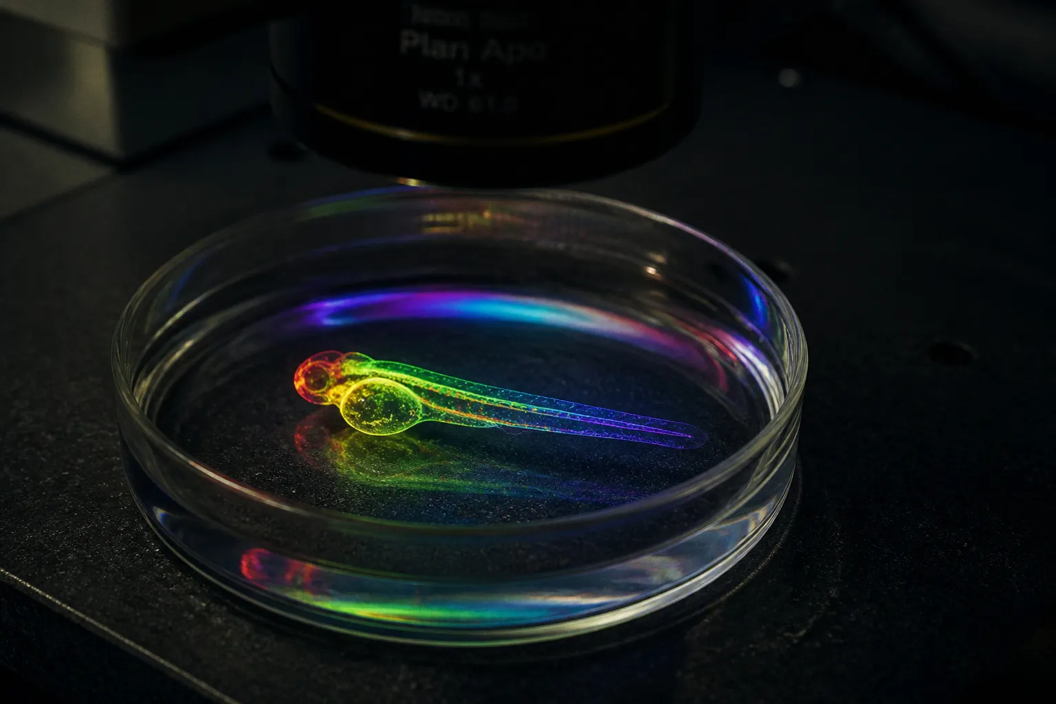
There, several features of the image are processed in parallel: contrast, orientation, spatial frequency, motion, and aspects of colour. The visual system does not wait for a complete object to arrive before it begins its work. It extracts relationships — boundaries, changes in luminance, directional patterns — and gradually integrates them into a scene.
That architecture matters for public engagement in neuroscience creative methods. The problem is not that visitors are incapable of understanding a neural circuit or an imaging dataset. It is that most scientific outreach asks them to enter through the least accessible door: a paragraph, a caption, or a figure designed for specialists. A laboratory may spend months refining a calcium-imaging experiment and then present the result as a static image with a legend beneath it.
The most effective neuroscience outreach activities do something more ambitious. They give the public another way to encounter the evidence. Sonification turns temporal structure into rhythm. Immersive visualization gives microscopic data a scale the body can inhabit. Artist residencies create room for interpretation without asking artists to become illustrators. Interactive exhibits make circuitry spatial and tactile. Digital storytelling uses movement, sequence, and uncertainty to show how research actually develops.
None of these methods is a substitute for explanation. They are ways of making explanation possible.
Sonification: translating firing patterns into auditory landscapes
Sound is a particularly useful medium for neural data because both nervous systems and musical perception are sensitive to timing, repetition, grouping, and change. A spike train is not a melody waiting to be discovered, but its temporal structure can be mapped into an audible form. The mapping is a design decision, not a neutral transcription: every choice determines what visitors will notice and what will disappear.
A burst of activity might become a denser rhythm. Differences in firing rate might control pitch, brightness, or the speed of a sequence. Synchrony across a population could be represented by a shared accent, a change in timbre, or the alignment of several rhythmic layers. The point is not to claim that a neuron “sounds like” a particular note. The point is to let the visitor perceive a pattern that would be difficult to inspect in a long table of timestamps.
Three parameters are often productive starting points:
| Neural feature | Sound parameter | What visitors may perceive |
|---|---|---|
| Spike rate | Pitch, tempo, or note density | A change in activity across time |
| Burst timing | Rhythm or repeated motif | The difference between isolated events and clustered events |
| Population synchrony | Shared accent, timbre, or spatial position | Coordination across neurons or regions |
| Trial-to-trial variation | Controlled changes in phrasing or texture | The fact that biological responses are variable |
| Missing or noisy data | Gaps, roughness, or reduced resolution | The limits of the measurement itself |
The last row is important. A polished soundscape can make an experiment appear more precise than it is. If the source data contain noise, incomplete sampling, or a threshold chosen by the researcher, the sonification should not conceal those conditions. A short spoken explanation can tell visitors which elements correspond to measured events and which have been added to make the structure audible.
Sonification should not turn uncertainty into atmosphere. Its value lies in making the structure of the evidence perceptible while keeping the limits of the evidence audible too.
A useful installation might place two recordings side by side — or, more accurately, one after another. The first could represent activity from a baseline condition; the second could represent a stimulus or a different stage of neural development. Visitors do not need to identify a “correct” tune. They can be asked what changed: Did events become more clustered? Did silence become less frequent? Did several voices begin to move together?
That question is often more productive than a claim that the audience is hearing thought itself. Neural firing is not a private soundtrack, and a translated spike train is not a direct recording of meaning. It is a perceptual model built from selected variables. The model becomes scientifically useful when the selection is explicit.
Implementation can remain modest. Pure Data, Sonic Pi, or a digital audio workstation can handle a first prototype on an ordinary laptop. A researcher can export timestamps from a recording pipeline, define a mapping, and test several versions with colleagues before investing in hardware. Headphones are useful for a small station; stereo speakers are better when the work needs to function as a shared public experience. Multichannel spatialization can be added later, but it is not a prerequisite for a convincing first exhibit.
The practical design problem is dynamic range. If every spike receives the same level of emphasis, the result becomes tiring and visitors stop listening. If all variables are mapped at once, the sound becomes ambiguous. One or two interpretable mappings usually work better than a virtuosic translation of every available column in the dataset.
A label should therefore include a small “listening key”: what controls pitch, what controls rhythm, whether silence represents missing data or low activity, and how long the source recording lasted. This turns the installation from an attractive audio object into science communication for neuroscientists and non-specialists alike.
Immersive visualizations: turning microscopic zebrafish data into public installations
The zebrafish is valuable in developmental neuroscience partly because its early life stages offer unusual optical access. In suitable experimental systems, researchers can observe neural structures and activity in living larvae using fluorescence microscopy, including light-sheet and other high-resolution approaches. The resulting data may show cells, axons, blood vessels, or changes in activity across time. To a visitor, however, a raw image stack is rarely self-explanatory. It is a sequence of slices, channels, artefacts, and intensity values.
The task of a public visualization is not to make the dataset decorative. It is to decide which relationships deserve attention and to show how the final image was produced.
A good installation may begin with the raw material and move through several levels of interpretation. A visitor could first see a single optical section, then a reconstructed volume, then a simplified view of selected structures. The changes should be marked clearly. “Raw,” “segmented,” and “rendered” are not interchangeable descriptions, and the distinction offers an opportunity to explain how scientific images are made.
Several techniques are particularly effective.
Selective opacity and layered rendering. A volume can be rendered so that one fluorescent channel is visible while another remains faint or hidden. This lets visitors compare anatomical structure with activity or observe how a segmentation mask changes the apparent form. The interface should include a reset state: people need to know what the researcher actually measured before they begin manipulating the representation.
Time-based visualization. A developing neural network is often easier to understand as a sequence than as a final object. A projection can show the growth, branching, or changing activity of a structure over time, with a modest timeline rather than a crowded control panel. The aim is not to accelerate every process dramatically. Excessive speed removes the pauses and reversals that make biological development intelligible.
Scale shifts. A zebrafish larva, a neural region, a cell, and a subcellular signal occupy radically different scales. An installation can move between them, but each transition requires an explanation of what has changed. A smooth zoom is visually persuasive, yet it can imply a continuous observational access that the microscope did not provide. A brief interruption — “new image scale” or “reconstructed view” — protects the science without breaking the experience.
Anamorphic and projection-based work. A stretched image can resolve from a particular viewing position, while a large projection can make a microscopic structure occupy architectural space. These formats invite visitors to move, but movement should be part of the scientific question rather than a theatrical trick. The installation might ask them to find the angle from which a neural tube becomes legible, then explain that the viewpoint changes the representation, not the underlying tissue.
The visual system is active in all of this, but it is not a single automatic “data reader.” Visitors bring prior experience, expectations, and cultural associations to an image. Motion can help reveal depth; colour can separate channels; scale can produce emotional impact. None of these guarantees comprehension. A vivid rendering may be remembered as an image without its experimental context.
For that reason, a successful zebrafish installation often has two layers. The first is immediate: a form that can be entered through movement, colour, or scale. The second is slower: a caption, audio track, or nearby screen explaining the microscope, the organism, the fluorescent label, and the steps between acquisition and display. Visitors who want only the first layer are not being tested. Those who want the second should be able to find it without leaving the work.
A laptop, a projector, and open or institutionally available visualization tools can support a convincing prototype. The larger costs usually come from venue requirements, projection conditions, fabrication, accessibility, and staff time rather than from the rendering software itself. A gallery-scale installation also needs practical decisions about brightness, ambient light, visitor flow, and whether the work can be understood by someone who arrives halfway through.
The strongest pieces do not pretend that a zebrafish brain is a miniature version of a human brain. They use the animal’s biology as a way to discuss shared principles — development, connectivity, sensory processing, regeneration, or the relationship between structure and activity — while naming the differences that make the model scientifically useful.
Collaborative artist residencies: bridging the gap between lab bench and studio
Artist residencies in laboratories are often described as collaborations, but the word can conceal an uneven arrangement. A scientist may hold the data, the institutional access, and the authority to define what counts as an accurate representation. The artist may be invited at the end, once the research has already been translated into a set of conclusions. In that format, the artist is effectively asked to illustrate a finished message.
A more productive residency begins earlier. The artist is given enough access to see how the research is made: the instruments, the failed preparations, the waiting periods, the conversations about controls, and the moments when an interpretation changes. This does not require exposing confidential material or turning the laboratory into a permanent studio. It requires treating process as part of the subject.
The structure can be relatively simple:
1. Agree on the research question and the boundaries of access.
2. Identify a manageable set of datasets, images, sounds, or laboratory processes.
3. Schedule conversations with more than one member of the research team.
4. Give the artist time to develop an interpretation before requesting a final product.
5. Build in a moment for scientific review, not as a veto over style but as a check on factual claims.
6. Present the work with an account of how it was made and what it does not show.
This arrangement helps avoid two familiar failures. In the first, the scientist hands over a figure and asks for something “beautiful.” In the second, the artist produces a compelling object that audiences interpret as a literal image of the brain, although it is actually a speculative or composite work. Neither problem is solved by adding more technical vocabulary to the wall text. The relationship must distinguish evidence, interpretation, and artistic transformation.
A confocal stack might become a stained-glass composition, but the work should not imply that the colours exist in the tissue exactly as displayed. A spike train might become a woven pattern, but the pattern is not a physical trace of a thought. A connectome might become an animated short, while the animation remains an interpretation of connectivity rather than a complete map of the organism.
The artist’s contribution is not limited to visual polish. Artists are often good at noticing scale, repetition, absence, rhythm, and the emotional effect of technical language. They may ask why a laboratory calls one structure “normal,” what is hidden by a threshold, or which parts of a process have been omitted from the public story. Those questions can make the outreach more honest.
Residency length matters less than the quality of the contact. A short, concentrated exchange may produce a precise work; a longer residency may allow the artist to follow an experiment through several stages. In either case, the artist needs a meaningful fee, access to people who can answer questions, and a realistic agreement about attribution and display. “Exposure” is not a substitute for payment, and a collaboration that depends on unpaid labour is difficult to present as a model of responsible public engagement.
The final object can take many forms: a sound work, a film, a sculpture, a set of prints, a participatory performance, or an installation built from discarded laboratory materials. The medium matters less than the contract with the audience. Visitors should be able to tell what is documented, what is reconstructed, and what is imagined.
Interactive sensory exhibits: making neural circuitry tangible for non-scientists
An exhibit about the nervous system does not have to remain on a screen. Touch, movement, balance, and smell can introduce concepts that are difficult to convey through a labelled diagram. But sensory engagement should be used with precision. The existence of a sensory stimulus does not automatically demonstrate the function of a particular brain region, and an enjoyable interaction is not evidence of learning by itself.
Four entry points are especially adaptable.
Tactile models. A large, robust model of a brain region or developing neural structure allows visitors to explore shape and relation with their hands. It can show a fold, a branching pathway, or the position of one region relative to another in a way that a flat image cannot. The model should be paired with a clear statement about scale and simplification. A structure enlarged for touch is not a literal physical replica, and a smooth surface may represent a boundary that is more complex in the tissue.
Tactile design also needs to include visitors who cannot or do not want to touch the object. Raised lines, audio description, large-print labels, and a digital equivalent can provide parallel routes rather than treating touch as a novelty reserved for one kind of visitor.
Olfactory pairings. Smell is closely connected with memory and emotion, but the pathway is more distributed than the familiar shortcut suggests. Odor information reaches the olfactory bulb from receptor neurons in the nasal epithelium and is then processed through olfactory cortical regions, including the piriform cortex, with connections to the amygdala and entorhinal areas. The hippocampus can contribute to odor-related memory, but the olfactory bulb does not simply project directly to the hippocampus as a single privileged route.
That distinction can improve the exhibit. Instead of telling visitors that a scent “goes straight to memory,” present a sequence of questions: What changes when the odor is familiar? How do expectation and context affect the experience? Why can the same smell evoke different associations for different people? A small set of labelled or optional scent stations, accompanied by a short explanation of receptors, the olfactory bulb, cortical processing, and memory networks, gives visitors something more durable than a neurological slogan.
The safest language is also the most interesting: smell can be a powerful cue for autobiographical memory, but recall is not guaranteed, and it varies with familiarity, attention, culture, and personal history. The installation should allow visitors to opt out, since scent can trigger discomfort, allergy concerns, or unwanted memories.
Motion-tracked interaction. A webcam and pose-estimation software can allow a visitor’s movement to alter a projected neural pattern. Raising an arm might reveal a pathway; stepping sideways might change the viewing angle; two visitors might need to coordinate to connect separate regions. The interaction makes agency visible without claiming that the projected trace is a direct readout of the visitor’s motor cortex.
Observation and action are related in the brain, but a visitor watching a movement is not simply activating one isolated “motor circuit.” The exhibit can instead explain that perception, prediction, planning, and action involve interacting networks, and that the response depends on the task and the person’s experience. That is a more accurate account — and it gives the visitor a better reason to try the interaction more than once.
Vestibular and balance experiences. A balance board or carefully designed shifting platform can introduce the vestibular system as a source of information about head movement and orientation. The apparatus should be stable, supervised, and optional. The point is not to make people dizzy. It is to show that spatial orientation is constructed from several signals, including vestibular, visual, and proprioceptive information.
A strong exhibit lets visitors compare conditions: standing still with eyes open, changing the visual scene, or adjusting the position of the head. The result may be surprising, but it should not be framed as a diagnostic test. Public engagement becomes weaker when a temporary sensation is presented as a personal measurement of brain function.
These experiences work best when each has one conceptual task. A tactile model can focus on spatial relationships. An odor station can explore context and memory. A motion interface can demonstrate sensorimotor prediction. A balance element can introduce multisensory integration. Trying to make one exhibit explain the whole nervous system usually produces a crowded interface and a thin explanation.
Digital storytelling: using real-time imaging to humanize neurobiological research
Neuroscience is often presented through its most finished images: the clean segmentation, the representative neuron, the final statistical plot. Digital storytelling can show the less polished reality without turning uncertainty into drama. A developing neural structure changes over time; a microscope must be aligned; a sample may fail; a researcher may revise the interpretation after seeing the data. These details are not distractions from the science. They explain why the science requires care.
Real-time imaging is especially suited to narrative because it gives the audience a sequence. The sequence can show growth, branching, response, recovery, or the gradual accumulation of evidence. But the story should not imply that every moving image is a direct view of a process in real time. Some sequences are time-lapse recordings, some are reconstructed from separate acquisitions, and some are visualizations of an inferred variable. The medium’s persuasive power makes those distinctions essential.
Three formats are practical for working laboratories.
Short-form documentary. A brief film can combine microscopy footage with a researcher’s voice, a simple diagram, and the sounds of the laboratory. The strongest voice-over usually answers three questions: What was the team trying to observe? What does the image actually show? What remains uncertain? A scientist does not need to perform enthusiasm or compress the entire project into a heroic breakthrough narrative. Specificity carries the story.
A time-lapse of axonal growth, for example, can be accompanied by an explanation of how the sample was prepared, how often it was imaged, and why the movement is biologically significant. If the footage has been accelerated, say so. If colours were assigned during processing, say that too. These small disclosures build trust precisely because they do not interrupt the visual experience.
Live-streamed experiments. A camera on a microscope or a view into a laboratory session can demystify research, particularly when the broadcast includes pauses for questions. Viewers may discover that a large part of experimental work consists of preparation, calibration, waiting, and checking. That is not a failure of the format. It is a correction to the idea that science advances through a continuous sequence of spectacular results.
Live events need moderation and clear boundaries. A host can explain what the audience is seeing, identify procedures that cannot be shown, and distinguish between an observation made during the stream and a conclusion supported by a complete analysis. The public does not need to see everything. It does need to know where the limits are.
Interactive web visualization. A browser-based representation of a dataset can let visitors rotate a structure, adjust a threshold, compare developmental stages, or select individual traces. Tools such as three.js, Plotly, and D3 can support different levels of complexity, but the technology should remain subordinate to the question. “What changes when I move the slider?” is not enough. The interface should make the consequence interpretable.
A visitor-controlled viewpoint may increase engagement because it gives them a sense of agency and encourages active comparison. It does not mean that the visual cortex treats the data as the visitor’s own construction through a specific, established mechanism. A more defensible explanation is that choice can prompt closer inspection: when people decide what to rotate, enlarge, or compare, they may spend more time examining the representation and forming their own hypothesis about it.
That distinction is not pedantic. Creative science communication ideas become credible when they resist the temptation to explain every successful interaction with a dramatic claim about the brain. Engagement can be observed directly — people stay, return, ask questions, or change the way they describe the image. The neural mechanism behind those behaviours is usually more complex and less necessary to the public-facing story.
Digital storytelling also offers a way to humanize research without inventing a personal drama. Show the decisions. Show the disagreement over a colour scale. Show why one experiment was repeated. Show the zebrafish care procedures and the ethical reasoning around the work. Show the researcher who explains a result cautiously rather than triumphantly. A laboratory becomes more understandable when visitors can see the chain of choices connecting a living model, an instrument, an image, and a claim.
A closing principle
The brain does not receive science through one channel. It detects, compares, predicts, remembers, moves, and revises. Public engagement becomes stronger when the form of the explanation respects that plurality.
Across these five methods, the structural move is the same: begin with the audience’s encounter with evidence, not only with the laboratory’s preferred format for storing it. A spike train can become audible, provided the mapping is explained and its uncertainties remain visible. A zebrafish imaging dataset can fill a room, provided scale, colour, reconstruction, and time are not confused with the specimen itself. An artist can reshape the research, provided interpretation is not disguised as measurement. A tactile, olfactory, or movement-based exhibit can make circuitry approachable, provided sensation is not presented as a shortcut to a single brain region. A live image can humanize a laboratory, provided the story leaves room for failure and revision.
The best neuroscience public engagement is not the most spectacular version of the science. It is the version that gives visitors a real foothold: a pattern they can hear, a structure they can explore, a question they can ask, or a decision they can follow. From there, technical detail has somewhere to land.