Neural network 3D printing: a four-stage exhibition workflow
A 3D-printed brain sculpture can fail long before the printer starts. The dataset may be scientifically sound, the mesh may look beautiful on screen, and the final object may still collapse into a lumpy plastic apology for a neural network.
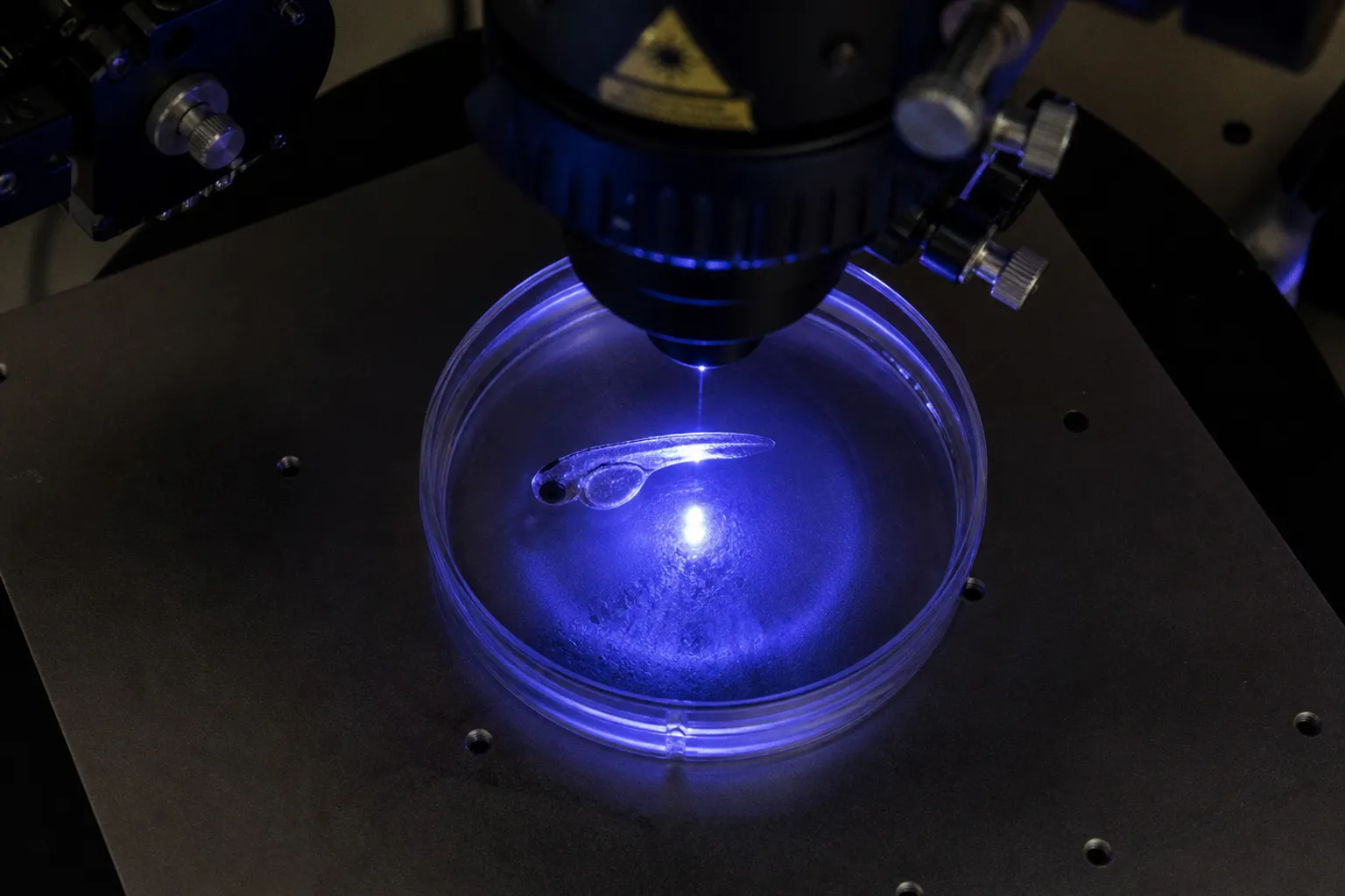
We have all seen some version of this: too much detail for the material, a beautiful pattern with no readable story, or a gallery piece that quietly turns a complex biological structure into decorative spaghetti.
The fix is not simply a better printer. A convincing 3d printed brain cell sculpture exhibition needs a pipeline in which the biology, computation, fabrication, and public-facing installation support one another. We can think of that pipeline as four connected stages: acquire or generate the neural data, optimize it into a printable mesh, fabricate the object, and then curate the physical space around it.
The order matters. If we skip the translation work between stages, the science gets noisy and the artwork becomes either technically impressive but unreadable, or visually accessible but biologically misleading. Let’s walk through the process as we would at the bench: starting with the failure most likely to waste your week, then fixing the handoffs one by one.
Stage one: choose neural data that can become a physical form
The first question is not which filament to buy. It is what kind of neural information you want the visitor to encounter.
A neural dataset can describe cell shapes, branching patterns, spatial relationships, activity over time, or a mathematical model of network growth. These are not interchangeable. A reconstruction of cellular morphology gives you a physical form with branches and junctions. An activity dataset may need a second layer of interpretation before it becomes a stable object. A time series might become a sequence of sculptures, a changing light field, or a single geometry in which time is encoded through thickness, density, or repetition.
That distinction keeps us from making a common category error: treating every visualized neural dataset as though it were a literal model of the brain. It is not. The final sculpture is a translation, and every translation has decisions behind it.
For a project connected to zebrafish neurobiology, the choice of source data can be especially productive. Zebrafish models offer a way to think about neural development, cellular organization, and behavior across scales, but the exhibition object still needs a clearly stated relationship to the underlying experiment. Are you showing a reconstructed network? A developmental transition? A computational interpretation of neural activity? Or a visual metaphor generated from biological constraints?
Those descriptions lead to different fabrication choices. A branching neuronal morphology may tolerate a delicate, open structure. A developmental series may work better as several related forms arranged spatially. A network model with thousands of connections may need selective abstraction, otherwise the viewer sees a dense knot and your carefully chosen biological distinctions disappear.
Start with a translation brief
Before anyone generates a mesh, write down four things:
- The biological unit: neuron, axon, dendritic arbor, network, brain region, or modeled connection.
- The visual variable: branch length, connection density, activity amplitude, spatial position, developmental time, or another defined parameter.
- The fabrication variable: thickness, height, repetition, void size, color, texture, or material.
- The audience claim: what a visitor should understand after looking at the object for less than a minute.
That last point sounds almost offensively simple, which is precisely why it gets neglected. A gallery visitor is not reading your methods section while standing beside the plinth. If the object requires a ten-minute explanation before its visual logic becomes apparent, the exhibit needs a stronger interface: a label, projection, audio layer, comparison object, or a more disciplined form.
Projects such as Ion Popian’s Mental Fabrication Project demonstrate one route from neural measurements to physical sculpture: EEG signals captured with NeuroSky sensors were converted into 3D-printed brainwave forms and exhibited at HarvestWorks. The result is not a literal printout of thought. It is a material transformation of recorded signal into geometry. That wording is not academic fussiness; it is the difference between a scientifically honest artwork and a claim the data cannot support.
A neural sculpture becomes clearer when you name the translation instead of pretending the plastic is the brain.
The same principle applies to sonification. If you turn neural activity into sound and then use the resulting structure to guide a 3D form, you have created a layered interpretation: neural data, an algorithmic mapping, and a fabricated object. That can be rich and compelling, but the layers should remain visible to the audience rather than being compressed into the vague promise that the sculpture somehow lets us see a brain thinking.
Preserve the data’s identity
Keep the original dataset separate from every artistic transformation. Save the acquisition parameters, preprocessing decisions, mapping rules, and mesh-generation settings. A clean project folder is not glamorous, but it prevents the familiar late-stage confusion where nobody remembers whether a thick branch represents a biological feature, a smoothing operation, or a printer constraint.
For a public exhibition, prepare at least three representations:
1. The source image or data view, showing what the biological material looked like before artistic processing.
2. The intermediate computational form, such as a point cloud, skeleton, or network graph.
3. The final printable object, with a short explanation of what changed between each step.
That progression gives visitors a way to read the work without flattening it into either pure data visualization or pure sculpture.
Stage two: turn the neural structure into a printable mesh
A neural network can be perfectly coherent as data and completely unsuitable as a 3D object. Thin branches disappear. Closed volumes trap support material. Intersections become impossible to interpret. A dense network produces a mesh that software can technically export but a printer cannot reliably resolve.
This is where most projects need less artistic ambition and more geometry discipline.
A useful mesh pipeline usually includes skeletonization or surface generation, removal of nonessential detail, thickness compensation, repair of non-manifold edges, and a final scale check. You are not trying to preserve every coordinate. You are deciding which relationships carry the meaning of the model and which details only create noise.
For example, if your source contains a thousand tiny branches but the exhibition object will stand on a pedestal at room scale, preserving all of them may make the form visually opaque. You might retain the primary branches, enlarge selected secondary structures, and use surface texture or color to indicate the smaller-scale complexity. That is not cheating. It is a declared change of scale.
The geometry needs an audience-facing hierarchy
A good neural model should have a visual hierarchy that survives distance:
- Primary structures should remain legible from across the room.
- Secondary branches should reward closer inspection without merging into a solid mass.
- Connections or synaptic regions need a consistent visual treatment, such as nodes, gaps, changes in diameter, or contrasting material.
- Scale references should appear somewhere in the installation, because a human-sized sculpture of a microscopic structure is otherwise easy to misread.
The computational side can help. Research on CNN-assisted geometric compensation has reported reductions of up to 88.5% in mean absolute geometric deviation for complex 3D-printed models. The practical lesson is not that a convolutional neural network will rescue every bad mesh. It is that automated compensation can correct predictable distortions introduced by the printing process, provided the system has been trained or calibrated for the relevant geometry and material.
You still need a human looking at the form. A compensated branch can be geometrically closer to the intended shape and aesthetically worse, especially if the correction makes neighboring structures fuse. Let the model support judgment; do not hand the entire exhibition to an optimization routine and hope it develops taste overnight.
Build a geometry decision table
| Design problem | What the visitor sees | Practical response |
|---|---|---|
| Branches fall below the printer’s reliable resolution | Missing or broken neurites | Increase minimum diameter, simplify the branching hierarchy, or shift the information into texture and lighting |
| Network density becomes too high | A solid knot with no readable paths | Preserve major routes, reduce secondary connections, and separate layers spatially |
| Many parts meet at one junction | Fragile spikes or fused masses | Redesign the junction with a controlled hub and test support removal |
| The object has no stable base | A delicate form that cannot stand safely | Integrate a plinth, hidden support, or a deliberate basal geometry into the model |
| The print looks like a generic organic form | Visitors see decoration rather than neural structure | Add a scale reference, source-data image, labeled structural features, or a comparative model |
| The mesh carries too much microscopic detail | Long print time and visually muddy surfaces | Keep detail that changes interpretation; remove detail that only increases file size |
The table is not a substitute for a test print. It is a way to stop making the same decision six times in six different software packages.
What if the data is dynamic?
A time series creates a tempting trap. You may want to encode every fluctuation into one sculptural surface, but the final object can only show one fixed state unless you add projection, light, motion, or a sequence of forms.
There are several cleaner options:
1. A temporal series: print several related forms and arrange them in chronological order.
2. A cumulative model: encode activity over a defined interval as changing thickness or density.
3. A split representation: keep the sculpture static and add a screen or sonification layer for temporal information.
4. A comparative pair: show the same network under two conditions, with a clear explanation of the mapping.
The choice depends on the audience’s task. If visitors need to compare states, two or more modestly sized objects may work better than one overloaded sculpture. If the point is accumulation, a single evolving form may be more powerful. The clean signal is the one the viewer can actually follow.
Stage three: fabricate the object without losing the biology
Additive manufacturing is often presented as though the file goes in and the revelation comes out. In practice, fabrication is where every unresolved decision returns with a small invoice attached.
Material, layer height, orientation, support strategy, nozzle or resin behavior, post-processing, and the final viewing distance all influence what survives. A neural sculpture with extremely fine branches may suit a high-resolution resin process, while a larger installation may benefit from a more robust filament print or a fabricated shell. The correct process is the one that preserves the intended information at the scale and budget of the exhibition.
Do not choose the technology from the prettiest online sample. Choose it from the most vulnerable feature in your model.
Match the fabrication method to the form
A compact form with fine surface detail can benefit from a high-resolution process. An open branching network may be easier to fabricate at larger scale with thicker members and fewer supports. A structure intended for repeated handling needs more mechanical tolerance than a protected object inside a case. If the sculpture must travel, pack, unpack, and survive several weeks of visitors brushing past the plinth, the most delicate version of the geometry may be the wrong version.
Two-photon polymerization sits at a very different end of the scale from public gallery printing. Researchers at TU Delft have used the technique to fabricate nanopillar arrays that mimic aspects of the three-dimensional extracellular matrix of brain tissue, creating structures that allow neurons to grow and form physical networks. Those arrays can be scaled down to structures around one thousand times thinner than a human hair. They are a reminder that neural architecture can be materialized for research at a scale far beyond what an exhibition printer can reproduce.
For an exhibition, you are usually not reproducing that microenvironment directly. You are translating its organization, pattern, or conceptual logic into a form a visitor can encounter. Keep that distinction on the wall label and in your own design notes.
Use test prints as experiments, not souvenirs
A test print should answer one question. If you change geometry, material, orientation, and color all at once, the result tells you very little.
A practical sequence looks like this:
1. Print a resolution ladder. Include branches and junctions at several diameters so you can see where the form stops surviving.
2. Print one critical junction. Dense crossings often fail before open branches do.
3. Print a representative slice of the full model. This reveals whether the local test still behaves properly when the geometry becomes crowded.
4. Print the smallest exhibition-scale version. The object that looks elegant on a monitor may become visually timid at room distance.
5. Test the post-processing. Sanding, curing, support removal, painting, and coating can erase the very details you worked to preserve.
Keep a simple fabrication log. Record the material, orientation, support strategy, failed features, and changes to the mesh. You do not need a heroic documentation system. A short note beside the file name is already better than relying on memory after three late nights and an unreasonable amount of cleaning.
Make the structural compromise visible
Every physical translation changes the source. Rather than hiding that, use it as part of the work. A deliberately enlarged synaptic region, a visible base that marks the cut plane, or a color change that separates reconstructed data from algorithmic extension can help visitors understand where biology ends and design begins.
This is particularly useful in neuroscience-inspired artwork, where a smooth organic appearance can suggest more biological certainty than the data warrants. A visible seam is sometimes more honest—and more interesting—than a perfectly seamless object.
Stage four: curate the gallery as part of the model
A successful neuroscience art installation setup does not treat the sculpture as a lonely object waiting for a caption. The room is part of the translation. Lighting, viewing height, sound, labels, circulation, and neighboring works all change what the audience understands.
Start with the viewing distance. If the object is intended to reveal branching pathways, visitors need a clear first view before they move closer. Strong side lighting can emphasize relief and cast useful shadows, but harsh lighting may turn a delicate network into a high-contrast tangle. A translucent material may reveal internal layers beautifully under controlled light and disappear under ordinary gallery illumination.
Then decide how much explanatory material the object needs. A useful label can answer three questions:
- What biological data or model generated the form?
- Which visual rule translated that data into geometry?
- What did the fabrication process change?
That is enough to orient most visitors without turning the plinth into a conference poster.
The UC Davis Center for Neuroscience offers a useful public-engagement model through its annual NeuroArt competitions during Brain Awareness Week. These exhibitions bring cellular reconstructions and microscopic neural images into public science-museum settings such as MOSAC. The lesson is not that every gallery needs a competition. It is that the audience benefits when scientific images are presented as objects with both visual appeal and an explicit route back to the research.
Add sound only when it earns its place
Neural activity sonification can make a static object feel temporal, but sound also changes the social behavior of a room. A continuous audio track may compete with neighboring works, overwhelm visitors, or make them assume the sculpture itself is generating a live signal.
If you use brain wave music or data sonification, define the mapping clearly. What controls pitch? What controls rhythm? Does the sound represent a single recording, a transformed dataset, or an illustrative composition? If the sculpture and sound use different source data, say so. A clean installation is not one in which every element claims to be the same thing; it is one in which visitors can tell how the elements relate.
Spatial audio, headphones, timed listening stations, or short audio intervals can help keep the sound legible. So can silence. A sculpture that already has a strong silhouette may need breathing room rather than another interpretive layer piled on top.
Design for the three viewing speeds
Most visitors encounter an exhibition in three passes, often without realizing it:
- The glance: silhouette, scale, color, and immediate atmosphere.
- The pause: recognition of repeated structures, branching, contrast, or movement.
- The close read: label, source image, process notes, and scientific context.
Your installation should offer something at each speed. A form that only works after a close read is too dependent on text. A form that works only as a glance may be visually attractive but scientifically thin. The strongest pieces let the visitor enter through the eye and then discover the method.
Where projects usually go wrong
The recurring failures are rarely dramatic. They are small decisions that compound.
The mesh is treated as the artwork
A raw network graph converted directly into a printable shape may preserve data topology while losing visual hierarchy. The viewer cannot tell which features carry meaning. A neural network is not automatically an effective sculpture just because it has branches.
The science is used as decoration
A label that says neural, synaptic, or brain-inspired without identifying the source and mapping gives the audience atmosphere but no knowledge. You do not need to disclose every preprocessing parameter, but you do need to explain the main translation rule.
The object is too fragile for its life in public
A branch that survives a controlled studio photograph may not survive transport, installation, or a child leaning in for a closer look. Build for the actual environment, not the render.
The scale is allowed to mislead
A large sculpture of microscopic architecture can feel like a literal enlarged neuron unless the installation provides scale context. Include a microscope image, a scale bar, a human reference, or a clear statement that the form is an artistic translation.
The technology becomes the subject by accident
Visitors may remember the printer, the resin, or the algorithm and forget the neural question. That is not always a problem, but decide whether the fabrication process is central. If it is not, keep the machine language in the supporting material rather than allowing it to dominate the room.
The print is the last experiment in the workflow, not the final authority on what the data means.
A working plan for the project team
For a small lab–artist collaboration, the four stages can be organized around distinct deliverables. This makes meetings shorter and exposes problems while they are still cheap to fix.
| Stage | Main question | Deliverable | Typical failure caught here |
|---|---|---|---|
| Data acquisition or generation | What neural information are we translating? | Curated dataset and translation brief | The project has a visual idea but no defined biological source |
| Mesh optimization | Which structures must survive in physical form? | Printable mesh plus scale and resolution notes | Fine detail disappears or dense regions fuse |
| Additive fabrication | Can the material and process preserve the intended hierarchy? | Tested prototype and fabrication log | The object is fragile, unstable, or unreadable at gallery scale |
| Spatial presentation | How will visitors understand the translation? | Installed object, lighting, label, and optional sound layer | The sculpture looks attractive but makes an unsupported scientific claim |
Set a decision gate between stages. Do not move into full fabrication while the team is still arguing about what the geometry represents. Do not finalize the label while the mapping is changing. And do not wait until installation week to discover that the most informative viewing angle faces a wall.
If the project includes public interaction, add one more layer of care: distinguish real-time data from preprocessed or precomputed data. A responsive installation can be engaging without claiming to display live brain function. The audience deserves to know whether they are seeing a current measurement, a recorded dataset, or an algorithmic demonstration.
From neural dataset to meaningful object
The strongest 3D neural art projects do not force science and art into a competition. They use the strengths of both. Neuroscience supplies structures, constraints, scales, and questions. Computation supplies transformations that the eye cannot perform unaided. Fabrication gives those transformations weight, shadow, fragility, and presence. Curation determines whether the public can follow the route from evidence to object.
That route should remain traceable. A visitor does not need a full methods paper, but they should be able to understand that the sculpture is neither a direct brain scan nor a magical cast of neural thought. It is a carefully designed interpretation built from data and shaped by material limits.
So, when your first mesh produces an impressive but unreadable tangle, do not immediately reach for a more powerful printer. Go back one stage. Ask which neural relationship disappeared. When the test print looks too sparse, do not simply add every branch back in. Decide which visual variable needs strengthening. When the gallery object feels beautiful but scientifically vague, fix the label and the mapping, not just the lighting.
Let’s keep the workflow honest and practical: define the biology, protect the signal, simplify with intent, fabricate for the real room, and give visitors a clear path through the translation. The result will not be the brain in plastic. It will be something more useful—a physical argument about how neural structure becomes visible, shareable, and open to interpretation.